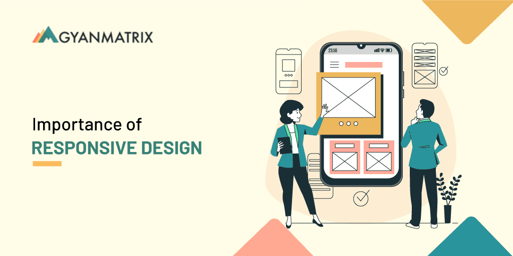
The Importance of Responsive Web Design.
Introduction:
A responsive web design is the big thing in web design technology right now. It is the gateway for driving the audience towards a particular brand. Responsive web designs allow your audiences to access your website from screens of any size. This improves usability, enhances accessibility, and also meets the needs of the ever-growing variety of devices that are currently being used to browse the internet.
A responsive web design can deliver a consistent experience to the users across different devices. This eliminates the need for the users to zoom, scroll, or pinch the screen to access the content. So, here’s a look at what responsive web design is all about:
Key Principles of Responsive Web Design:
Listed below are some of the major principles of a responsive website:
- Fluid Grids
A fluid grid allows the content to dynamically rearrange and resize itself so that it can fit the screen sizes of different devices. It ensures that a consistent website structure is maintained. The fluid grid also helps to increase the readability of the elements present within the particular grid. The elements easily scale and reposition themselves. This offers an optimized user experience.
- Flexible Images
The images must be flexible enough to adapt to different screen sizes. Flexibility can be easily achieved by setting the maximum width for an image. As the container resizes, the image will also scale proportionally so that it is able to fit within the grid. Another great way of enhancing flexibility is to use the various CSS properties. Flexibility also prevents the image from getting cropped or overflowed on the screen.
- Media Queries
Media queries are a property of CSS. They allow you to implement a particular block of CSS features only if a certain condition is true. Using media queries, you can easily create different layouts based on the size of the viewpoint. This can be an effective way of getting a responsive website designed for the end users.
Benefits of Responsive Web Design:
Let us have a look at some of the perks of getting a website built:
- Improved User Experience
One of the primary reasons to opt for responsive web design service is to enhance user experience. Being a website owner, you would definitely want the users to like your website so that they can keep coming back to what you have to offer. With a responsive design, the users enjoy a better experience. They also form a really good impression of your brand.
- Increased Accessibility
Today, we live in a mobile-first era. Most people prefer browsing the internet from their mobile devices. This increases the need for you to design a responsive website. By getting a fully responsive website design, you can easily increase your website accessibility. People will find it really easy to access the content on the website from whichever device they own.
- Search Engine Optimization Advantages
SEO is one of the key aspects of digital marketing used by brands to boost their presence in Google’s search engine rankings. The closer you get to the top of the search results, the better your chances of getting noticed on the internet. A responsive website design can help with SEO. Google always gives preferences to websites that are mobile-friendly. That way, you can easily improve your visibility on the net.
- Cost-Efficiency and Maintenance
Maintaining different websites for different devices can be an expensive affair. By using a responsive website, you can save the need to maintain different websites. You just have to get a single website designed that will appear to be equally appealing on all devices. You can also save a considerable amount of money on regular website maintenance.
Challenges and Solutions:
Here are some of the common challenges in implementing responsive design and strategies to overcome the challenges:
Navigation issues:
Responsive navigation acts as a roadmap to your website. It helps the users understand where they are going to find what. The navigation menus should adjust to different devices and not have a different structure.
To prevent navigation issues, you must test your website design on multiple devices. You should also design your website architecture in such a way that the navigation menus are not hampered in the designing process.
Browser compatibility issues:
The latest browsers will automatically adapt themselves to the screen size of the users and display the website with the right layout. However, old web browsers do not support this functionality.
You should try using different styling sheets while designing the older web page versions. This will help you to ensure that the website loads equally well, irrespective of the browser version.
Page loading time issue:
The loading time can dramatically increase the bounce rate. You may have a beautifully designed website, but if the loading time is not good, then the performance will instantly slow down.
Make sure that you keep the number of images, videos, and gifts to a minimum, as they can impact the loading speed. You should also ensure that the CSS elements are used appropriately.
Responsive Design in E-Commerce:
Now, let’s see how a responsive web design can give a boost to E-Commerce businesses:
- Impact on Online Shopping:
A responsive web design can offer users an enhanced shopping experience. They can look through the available range of products and services from whichever device they own without any hindrance.
- Conversion Rate Optimization (CRO):
CRO can be achieved by optimizing the layout, features, and functionalities of the website for different screen sizes. Other options would be to add easy navigation features and create intuitive website elements.
- Best Practices for Responsive E-Commerce Websites:
Here are some of the best practices to follow while opting for a responsive website development service in India for your E-Commerce website:
- Always put your focus on the website’s loading speed.
- Optimize the images for different screen sizes.
- Implement tough-friendly navigations.
Conclusion:
So, reach out to the best website development company in Bangalore and get your responsive website designed in the best possible way. This will offer you a competitive edge and give your users an enhanced experience. You can also give your website the popularity that it deserves.
SaaS Development Company in India: Why India Leads the Global SaaS Innovation Curve
SaaS Development Company in India: Why India Leads the Global SaaS Innovation Curve The Software-as-a-Service ...

Top Digital Transformation Companies: Pioneering Innovation in the Modern Business Era
In an era where technology underpins every facet of business, digital transformation is no ...
7 Strategic Reasons Why GCC India Is the Silent Engine Behind Tech Giants’ Growth
Global Capability Centers in India have quietly transformed into innovation powerhouses, playing a pivotal ...

Global Capability Center India: Strategic Growth Engine for Global Enterprises
Executive Summary Global Capability Center India is evolving far beyond traditional offshore service models into ...

Unleashing Blockchain development: Driving Business Efficiency and Innovation
Blockchain Development is no longer just a buzzword—it’s a game-changer for businesses across industries.From enhancing ...

Scale Your Business Through GyanMatrix – Your Trusted Partner for Global Growth
In today’s rapidly evolving business landscape, scaling your company efficiently while managing costs and maintaining ...